
We cannot talk less about colors when it comes to designing. You need to know effective color psychology in custom embroidery to make exceptional designs. The colors you pick represent your personality, convey messaging, evoke emotions and create brand identity.
It doesn’t matter if you are designing custom embroidery patches for street fashion, brands, corporate or sports team you need bold colors. In this guide, we will explore the right color psychology for embroidery and how you can create unforgettable first impressions.
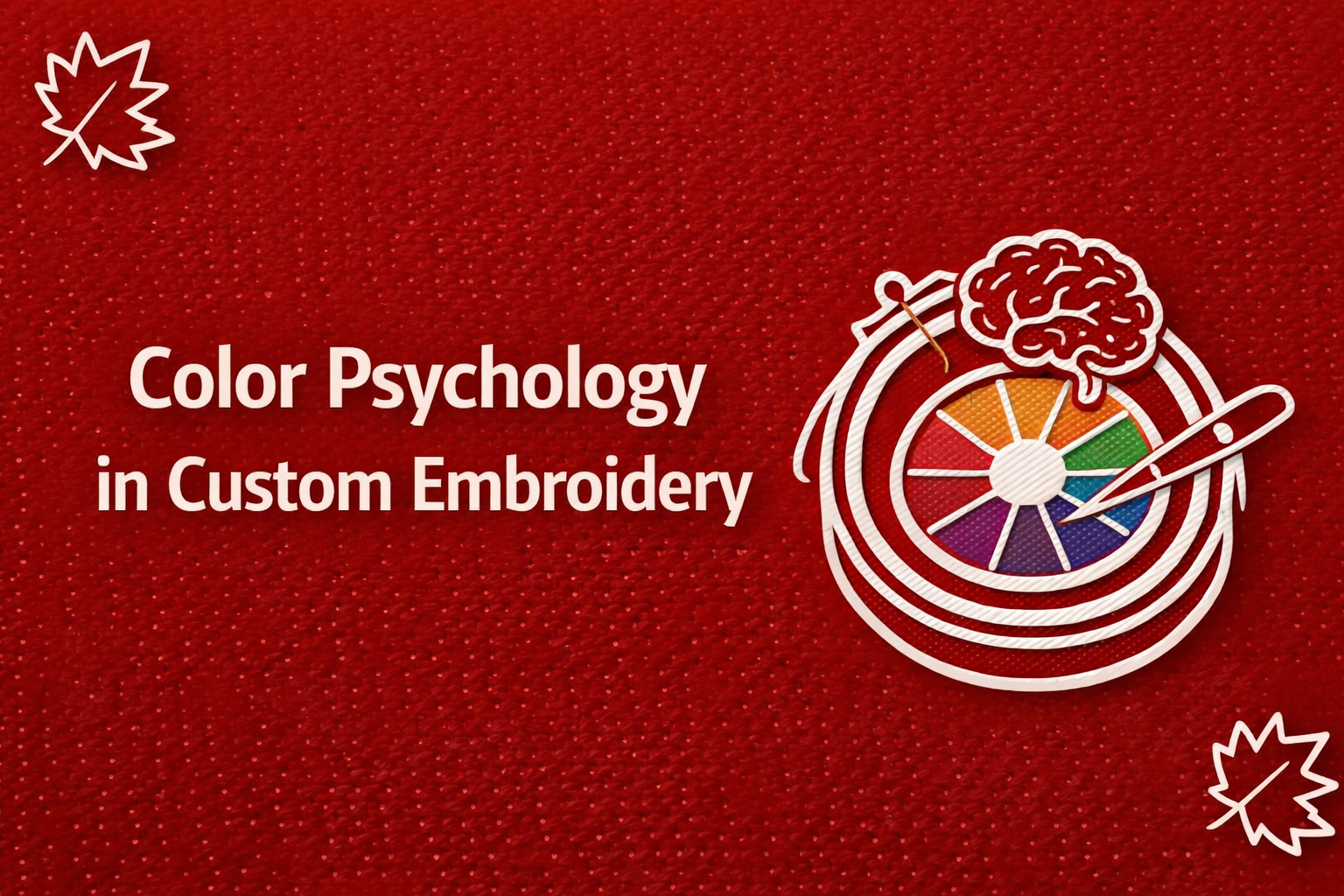
Why Is Color Psychology in Custom Embroidery so Important?
You can transfer certain emotions, create perceptions and predict behaviours in customers through the right color psychology. That’s why you need to learn the perfect color psychology in custom embroidery patches if you want to grow your fashion brand. It helps attract more audience through stunning artworks and great color contrasts.
Using bold colors in your custom embroidery patches builds sudden excitement and urgency for customers. When you apply these effective color psychology techniques in your embroidery patches, you can build a strong voice.
Warm Colors: Creating Energy and Attention
You can make your designs on patches stand out by choosing warm colors, and they are good at grabbing attention:
Red: Passion and Power
You can put red color in embroidery patches to create urgency and show strength. Additionally, the red colors show a strong energy and catch people’s eyes better. You can pick the red color for the following embroidery patches:
- Sports team patches
- Promotional branding
- High-visibility designs
Orange: Creativity and Enthusiasm
To steal the energy from red and the cheerfulness from yellow, orange colors perform well for embroidery patches. For effective color psychology in custom embroidery, choose the orange color for a vibrant and friendly impression. Likewise, it is suitable for both youthful and creative branding.
Yellow: Optimism and Warmth
The next color you can pick for outstanding branding is yellow, which combines both brightness and positivity. But make sure to use neutral tones to prevent making the view cleaner.
Cool Colors: Building Trust and Balance
On the other hand, cold colors are a great tool for giving calm and professional messaging to consumers. Knowing the color psychology in custom embroidery patches behind cold colors lets you choose a good one for corporate branding:
Blue: Trust and Reliability
The reason why most corporate businesses and organizations use the color blue is that it creates a strong connection and builds trust. However, you can pick the blue color for custom embroidery patches, like:
- Corporate uniforms
- Educational institutions
- Healthcare branding
Green: Growth and Sustainability
You must have seen green being used in hospitals and earth-related company logos. Because the green color represents health and nature In unique way. So if you are running some eco-friendly brand or wellness-focused business, then green color embroidery patches are ideal for you.
Purple: Luxury and Creativity
Next, one of the nicest picks you need for the right color psychology in custom embroidery patches is purple. Meanwhile, purple is ideal for both imagination and sophistication in products. You must have seen purple color in most premium brands to give a artisitic vibe.
Neutral Colors: Adding Depth and Versatility
Finally, the most important color psychology in custom embroidery you need to learn is how to use neutral colors perfectly. Because the neutral colors are ideal to create a certain balance and outline the designs. Most popular neutral colors you choose for custom embroidery patches include:
- Black: Bold, powerful, and ideal for contrast
- White: Clean, minimal, and versatile
- Gray: Subtle, professional, and modern
You can either use these colors as a base or outlines on the edges to pop up the actual custom patch designs.
Color Psychology in Custom Embroidery for High-Impact
Choosing the right color combination helps you convey your brand message the right way. Believe it or not, choosing multiple color contrasts is as important as choosing single colors for embroidery patches.
| Color Strategy | Example | Effect |
| Complementary | Blue + Orange | High contrast, eye-catching |
| Analogous | Blue + Green | Smooth, harmonious look |
| Triadic | Red + Blue + Yellow | Balanced and vibrant |
You can make your embroidered patches visually outstanding and memorable by using the above color strategies.
Why Color Psychology Works in Embroidery Design
Colors work best in embroidery because it triggers emotional and psychological responses with customers. But the key to achieving the best color combination is to use the right one and talk to people through colors.
For example:
- Bright colors attract attention and increase engagement
- Cool tones build trust and credibility
- Balanced palettes improve readability and design clarity
This is the main reason why so many successful brands pay millions of dollars just to customize their brand logos. Moreover, popular brands like Gucci, Zara, or LV spend days selecting colors for bags, uniforms, patches and promotional products.
Practical Tips for Choosing the Right Colors for Embroidery
If you want to make the most of color psychology in custom embroidery, you need following expert tips:
- Understand Your Audience: Younger audiences prefer bold colors, while professionals lean toward subtle tones
- Use a Thread Color Chart: Ensures consistency across all designs
- Match Brand Identity: Stick to your brand’s color palette for recognition
- Consider Fabric Base: Colors appear differently on various materials
- Test Before Finalizing: Always preview designs before production
After understanding these few tips, you can create both visual and emotional impact on your customers.
Final Thoughts: Make Your Embroidery Designs Stand Out
Create an unforgettable impact on your audience through mindful color psychology in custom embroidery. Always pick the right colors depending on what service or products you are designing for. Select the proper color contrasts with a mixture of both neutral and cold or warm colors.
Get Quality and Multi-Color Custom Embroidered Patches in Canada!
Contact CustomPatchMakers.ca for premium embroidery patches specifically made using cold and warm colors.
FAQs About Color Psychology in Custom Embroidery
What is color psychology in custom embroidery?
Color psychology in custom embroidery refers to using colors to create emotions, brand identity and visual impact in patch designs.
Which colors are best for embroidery patches?
Bold colors like red, blue, yellow and black are commonly used for custom embroidery patches.
Do colors affect embroidery patch design?
Yes, colors influence readability, branding and emotional response in embroidery patch designs.
How many colors should be used in embroidery patches?
Using 2 to 5 colors is recommended for clean and professional embroidery patch designs.
What colors are best for business embroidery patches?
Blue, black, white and green are ideal for professional branding embroidery patches.